Monday, 29 February 2016

Name of my artist


Choosing the name of my artists (thought processes) 

The name of my artist is very important, many artists use their name. Such as Katy Perry or Freddie Mercury or even Michael Jackson. 

However a notable increasing trend in my genre of music is that artists are increasingly using more and more obscure names. 

Clearly this gives it a catchy sense and becomes more memorable. 

Some artists / bands names in the indie pop genre 


Lana Del Rey - Elizabeth Woolridge Grant 
Marina and the Diamonds - Marina Lambrini Diamandis
Florence and the Machine - Florence Welch 
The XX
MGMT 
Of Monsters And Men 
So, taking from this, in order to conform to the convention of my genre I must ensure that I create a similar persona to all of the leading artists. 

Brainstorming Ideas. 
My artists actual name is Mollie Mae Moment. MMM for short. 
Finding inspiration from different websites


Overall I was not a fan of using this method, it didn't seem very personal but it gave me inspiration to pair random words together in order to get an artist name. 

I also thought about my name 'Enea Luciano'

Enea sounds rather good for an artists name because it is a rare name, not many people have it. This is similar to Lana and Marina, so I thought I would go with it. It has three syllables which is what Marina has, so therefore I started trying to put 'Enea and the' with something. 

I then started to mess around with the idea of a name in my head, so I thought of Enea del Rey for example, Enea and the Machine, and Enea and the Diamonds. 

I thought of the Diamonds in a card style, therefore the idea of the Queen of Hearts came into my head so I tried to make Enea and the Hearts come together. 

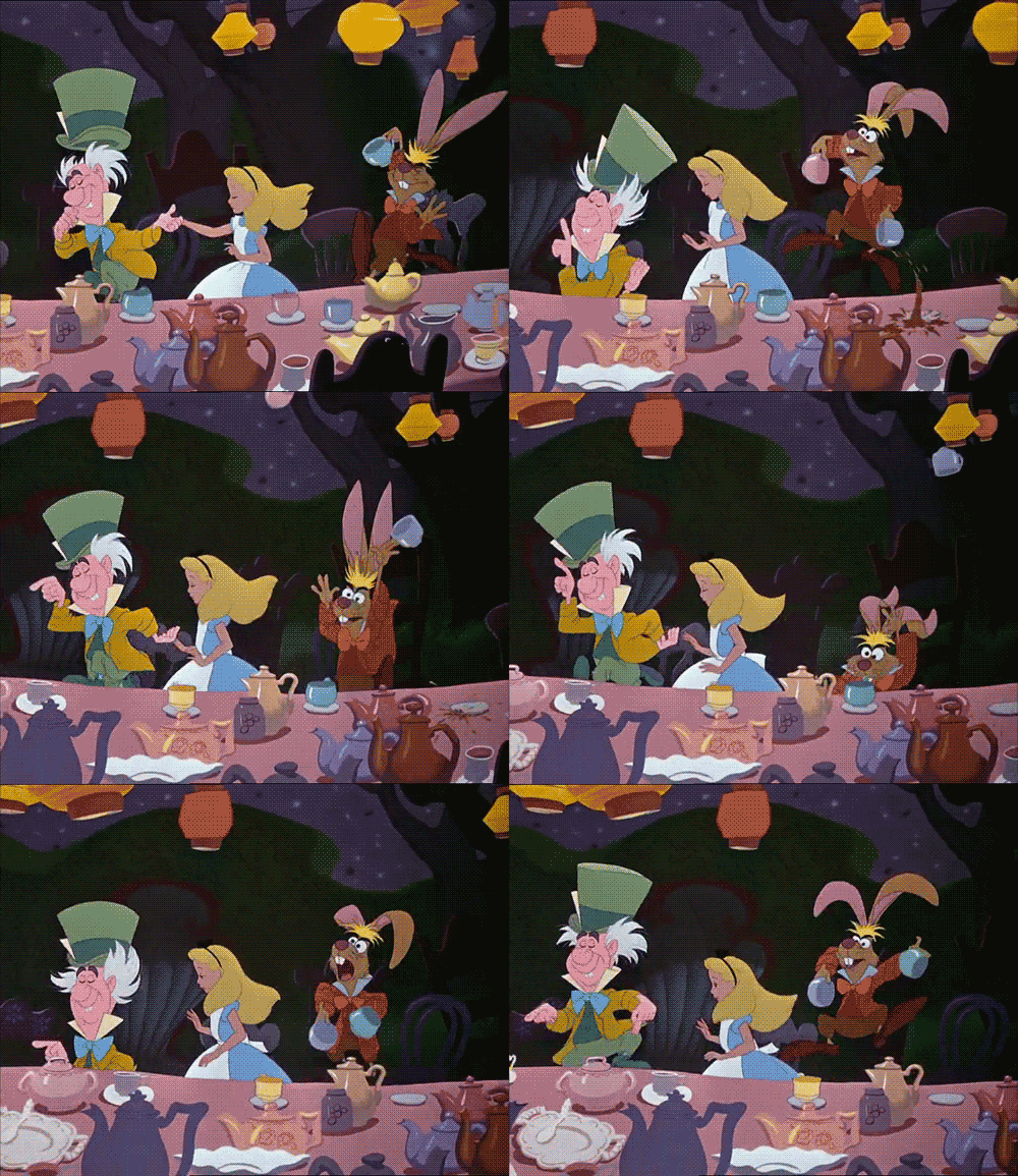
This is again referencing Alice and Wonderland this give my artist some context to her album called Mad Hatter. 

Friday, 26 February 2016

Magazine Advert Analysis #4


This following magazine advert by the Maccabees in promotion of their album 'Given To The Wild' is probably one of my favorite magazine advertisements based purely on the fact the entire advert evolves completely around the design of the album itself.

Yet again the exact same image form the album cover has been used, however just magnified. This emphasises just how important this is not only to the album itself but to the promotion of its sales, as if this image is not good enough then it will not be recognisable as an icon to symbolise a band or the album itself. The Maccabees have purposely used their album artwork here like previous adverts to create a symbolic presentation around this distinctive image. This distinctive image is what has to represent their album. Therefore they have also used the exact sane two fonts that have been also used on the album cover. This is to create a theme the resembles the album. A mixture of two fonts, one serif and one sans serif. The only use of sans serif font is the name of the band; Maccabees which is capitalised and centralised in the advert however placed at the top of the page in a 3 column/3 row by letter scenario, almost like a logo or brand of the band. The reason it is placed at the top of the page is because in the center of the page and album cover is the focus of advert, which is a bee hive. Therefore linking to their name. The name is purposely in sans serif to create a logo and to give a bold entrance at the top with the white font against the light blue background of the sky.


The photographic album artwork has a great contrast in colour which attracts attention and stands out to the viewer as well as complimenting the font and feel of the advert and album well. The bold difference between the top of the photograph and the bottom with the obvious line split in the middle of the page creates a divide, almost as the top and bottom are separate parts. This is then used to advantage as the top part just consists of the bold logo of the band name and the  at the bottom below the beehive all the information in serif font is placed. This is also contrasted against a a darker colour at the bottom therefore we are incline to see the band name first due to the brighter colour, as we are incline to look to the light as humans. Therefore we then read down the page and see the rest of the information which is presented more elegantly and in a feminist way, which for  male band would be a modern indie and more independent style to break away from the mainstream.


The bottom of the page information consists of the album title just below so the next thing we would see in slightly larger font than the information below. Then just below this a slight thin line and then the date of the release in a slightly smaller size. This being rigtht below the title of the band shows the order in importance which is then presented in size also. The line resembles the information then about the album. Below this is then just a single quote about the album by one big well respected magazine: NME. This is presented in the exact same way just below in slightly smaller size and the same serif font. However the record label and website are not centralised and in fact in the two corners at the bottom of the page. I think this is better and more professional design for the synergy used. As not everyone is interesting in this and therefore stereotypically in design website and contact information is based in the corners, away form the real art to stop it from taking the audience away from the message or the focus.


To me this magazine advert is a great example of a successful advert that meets all the needs well and promotes the release of their album well by coordinating within their album theme.

Thursday, 25 February 2016

Magazine Advert Analysis #3


As you can see Arctic Monkeys have gone for a mono tonal black and white style of magazine advert. Almost as if it were an old rock poster. However this is what fits in with he style of Arctic Monkeys as they are a indie-rock band that is fascinated with old rock and want to try and recreate this style of music or reinvent it as such. Therefore this has been conveyed in their magazine advert and we understand their genre of music through this as rock. This magazine advert has a slightly alternate style though. The entire magazine has a black background and isn't the album artwork or a similar image to it. The album cover is just centered and bordered in the middle of the advert. This advert can be seen as breaking away from the rest of other adverts and this minimalist style of advert is in fact making the album more iconic as it stands out. However this could also ruin its credibility due to it ruining its image. his could in fact take us away from h image of the album cover, therefore when we see this album cover it isn't as memorable or recognisable to us. However this can work in both ways as it can in fact have a bigger impact on us as a viewer due to it's simple style.

In this poster the one thing that stands out to me is the bold serif font placed above the album artwork in the center. This traditional style of ext reinforces this style of rock and roll hat the Arctic Monkeys want to live up to. This yet again makes their genre and band image recognisable. his bold white ext against the plain black background creates a strong contrast that would stand out to the viewer as well as being placed a he top of the page emphasises is place and their name. This being one of their first albums also relates back to how they want to come across and want their name to be recognised to the public. Therefore this strong theme of rock n roll as well as this bold and emphasised text at the top shows how they want to remembered. this simple style of magazine advert with not emphasising the album cover could relate to how they want to promote themselves more than the actual album as they want to become a band image.

This strong contrast in colour of black and white is used throughout. However we yet again see a use of more than one font, although this time it is 3 and not only 2. This I feel is too much and makes this simple style of magazine have almost too much going on and juxtaposes the style that they are going for. I feel this use of three fonts becomes distracting to the look and style of the advert as they want to come across with a rock n roll style. I think it is more successful in terms of an advert to emphasise the image of the album cover which is therefore done through the dominating image of the background which they have not done, as well the mixture of font draws s away form the message. Furthermore the advert having slightly too much wording about reviews etc which is good however you just want to convey a simple message about adverting our album which this advert doesn't focus on I feel, however I feel this is because this is their debut album. I think this magazine advert is tying to be too different is almost just promoting their band and its image rather than the actual album itself.

Wednesday, 24 February 2016

Magazine Advert Analysis #2


I am now looking at another magazine advert in promotion of Coldplay's album 'Mylo Xyloto'. As you can see this is a very vibrant and colour packed advertisement as well as the title being strange which makes it hard for me to take meaning from it. Therefore I looked into the title and the meaning of it and found this on Wikipedia:

"Mylo Xyloto is a concept album and a thematic rock opera. The album tells the story of a war against sound and colour by a supremeist government, set in the world of Silencia, an Orwellian society. Silencia has been taken over by a supremacist government, led by Major Minus, who controls the population through media and propaganda. His aim is to take sound and colour off the streets in hope to draw away "feeders", creatures that use such energy to hunt its prey. The album follows Mylo, a "silencer", who is one of an army tasked to hunt and track down "sparkers", people who harness light and energy and use it to create sparks, comparable to graffiti in real life. He comes across Xyloto, a sparker who is the most wanted by Major Minus. Through Xyloto, Mylo discovers his sparker abilities and his affiliation with the Car Kids, a major sparker faction founded by Mylo's parents Aiko and Lela. Drummer Will Champion has noted that the album is a story of the characters "falling in love and trying to escape together", with a general theme of "love conquering all"."


This is stating the background context behind the vibrant and over the top graffiti style of colour as well as the strange title name. Moroever this is the exact same artwork used on the album cover. However this is just a magnified version to fit the poster. his again makes the image of the album artwork iconic and recognizable when on shelves and to the viewer when buying albums etc. Furthermore this iconic artwork has been again emphasised by the outlined text with no fill to show the background. This is highlighting just how important the background of coluorful graffiti is. This bold serif font white outlines ext has a hippy style to it along with the colourful background as it were an album o based round the style of the 70's. This again fits in to the style of Coldplay as the are a very independent style of music that are environmentally friendly and almost like 'modern day hippies'. This is a way of them becoming an iconic image, almost a brand and fitting into his theme of style which is recognisable due to the history of the 70's. Furthermore this distinctive white outlined ext and colourful background creates a contrast and the white text throughout is purposely chosen o be visible as well as become distinctive.

The album name is the largest text on the advert which adds focus to the text, furthermore the focus is on this text due to its centralization. Furthermore the balance on the image creates an aesthetic appreciation due to the date of the release and Coldplay's name above and below the album name in the center. Furthermore the other smaller information about the pre-order is then places at the very bottom in smaller text and a slightly different font and more eligible which is another example as before of his multi-font advert. This is again used to show iconic font of the album artwork font as well as eligible font to send across important information. Hence the easy to read and plain serif font text. Again the website s an even smaller text at he bottom and the logo again has his outlined with no fill to fit into is advert theme.Overall the look of this entire poster is very distinguished and would catch the ye of any audience that would be looking ins direction or passing by. Furthermore I feel this distinguished style of advert is what makes it iconic and would therefore increase sales and make it more recognizable to he audience and he would therefore associate this look with Coldplay.

Magazine Advert Analysis #1


In the following next couple of posts I will be looking at magazine adverts for the promotion of an album and the way it promotes the album in order to increase sales. Here I am looking at Jay-Z's promotional magazine advert for his album 'The Blueprint 3'. This advert I feel captures how it is possible to have something so simple and minimalist yet still highly effective. As we can see the advert has used a similar if not the same image from the album cover. This makes the album artwork iconic and symbolises his new album due to this unusual design and idea. The monochrome white musical interments etc have a great minimalist effect against the white background, therefore allowing the blood red overlaying 3 lines and text to have a greater impact and stand out to the audience. Therefore the bold serif font at the top saying 'Jay-Z' stand out to us as well as the rest of the other text due to its size and boldness as well as the fact it is serif and all other fonts are sans-serif. This allows his name to stand out more and make it recognisable. This strong contrast in white a white background with red and black in the foreground creates a high contrast allowing a pop to the image as if it were a colour splash effect.

There are two alternations in font. The main 'Jay-Z' title text at the top and all the text below in a smaller text. This can cause an unprofessional as it can be seen as breaking a certain theme or style of an image. However I think this has been nicely done so that the title just con rats with the rest of the text to stand out, rather than using the same font and it blending in. This allows the title of 'Jay-Z' and his artist name to become almost a brand image against the original rest of the text in the advert. The black and white contrast in text is a traditional look that will be aesthetically pleasing to any audience. Certain songs have been bolded that would be recognisable already to the public and therefore catch their attention as they know already about this release in the back of their mind. Furthermore the date of the release is slightly bigger than the rest of the original text to stand out and stick in the viewers mind. At the bottom below all this text colour splash is once again used with the record label brand icon with the red once again to stand out and create an iconic approach and let the viewers understand this is associated with this iconic label of Roc Nation. Below this is then the artists website which is an example of synergy as they are publishing there weskit and label as well as just the album. This would of course increase popularity and sales.

Monday, 22 February 2016

Good and Bad photos for my ancillary text


black and white disney creepy dark alice in wonderland
I have made a Prezi just to show how much the quality of the photos are when it comes to the ancillary texts. I feel as though this is important because of the fact that I need to make sure my imagery stands out and draws attention. I can only do this with good quality images. In order to achieve this I have made a presentation to display some good images and bad images for my ancillary texts. I feel as though it is important to recognise what makes an image bad, therefore reducing the chances of me using on in my final products- this would ruin the realism of my product and therefore would not seem professionally made. 

Friday, 19 February 2016

Draft 2 + Feedback


Disney magic lightning walt disney mickey mouse

The video is now 1.40 mins, with still 2.00 minutes to go...

I have added to the video by 1 minute and 10 seconds. 
Notable editing techniques used are the following: 
-mirror effect 
-kaledescope effect 
-editing exposure
-editing saturation 
-editing the speed of clips 
-rewinding clips 
-fast paced editing 
-editing the clips to be in time with the music 
-lip syncing correctly 
-use of zoom
-pans
-tilts
-tracks 
STILL TO ADD!!!
-More lip syncing 
-two/three shots 
-shot reverse shot 
-match on action 
-editing with the special effects 
-transition effects 
-initial naming the video


Overall, I am happy with the turnout of this session of editing taken place on the 18/02/2016 
I spent a total of 6 hours on this piece of editing. I didnt actually expect it to become quite as abstract however, I am happy with the results. 
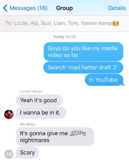
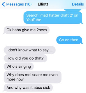
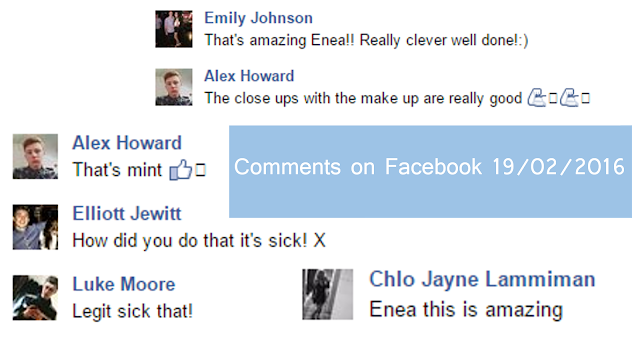
I asked for feedback from my friends and family... 


I have also made a Facebook group with ages of boys and girls with ages from 13-19. This way I can make sure it appeals to my target audience. 
Hollywood Suite movies music movie film

Update of filming 19/02/16


Friday, 12 February 2016

Update on digipak research

Now that I have looked at the front covers of several artists, I'm moving onto the back cover as this is usually the next thing my target audience will look at. There are conventions that are followed in terms of what features on the back cover, but similarly to the front cover, these can and are being broken in the current industry. The back cover is one of those things where different artists change the conventions in order to be more suited to them as people and to give a cohesion with their music. 

Thursday, 11 February 2016

Front Cover Album Research

I have made a short presentation on the conventions of a front cover and put them into context in the slideshare below.


Here is some front covers that I have analysed in much more depth. 


Spine Research

This is my creation and design. I think that it is conventional because of the fact that I contains all of the key codes that are required by the conventional spines of albums. 

Tuesday, 9 February 2016

Update 09/02/2016

house alice in wonderland stuck

I have organised for all three cast members to come to my house to film. 
It is convienient for this because all three live in brough (very close to me) 


alice in wonderland cartoon

Sunday, 7 February 2016

How to make a digipak

cd 90s

I really want to be able to make my product when I have designed it and therefore I have been able to track down a video explaining it on YouTube (as seen on this post). Once I have designed my digipak I will then start to construct it and I thought I would make a post on what source I used to be able to make one. 

Thursday, 4 February 2016

Why I like These covers

I like this because of the different use of colours, as I have used different colours in my video I feel as though this would go nicely. The only issue is that it isn't necessarily conventional for the indie pop genre, it could very easily be for a rap album due to the use of graffiti, however the bold use of colour is what enables it to be adapted to be indie.

This is very relevant to my music and to my actual video as I have a rabbit head in mine, this therefore would fit very well with my digipak. I like the contrasting colours and the indie ideology being brought through by the use of paisley and satin shirts, Although I am not keen about the small writing the overall imagery of this album confuses and gives the impression of a conceptual song with conceptual music videos. 


Okay so I know I keep using Marina and the Diamonds as my examples, but the trust is I really do like it. I like the idea of her front cover suggesting a vintage a retro tone. This is done by the use of the effects added to effectively distort the image and make it look indie in that way. I like the use of colours as well, I feel as though the teal/green/grey colours really go well with a cream face/ white. 


Monday, 1 February 2016

Preparations before filming and makeup

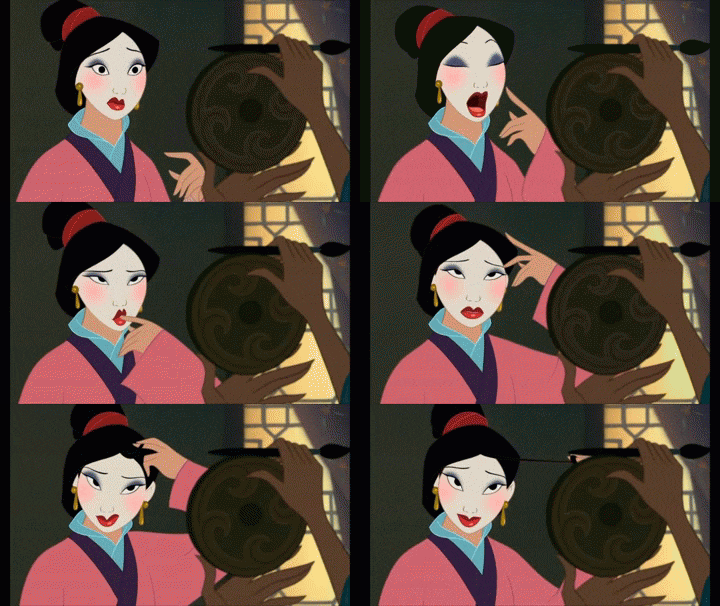
disney makeup mulan fabulous glamorous

Makeup 1/2/16
Queen of Hearts 
DISCLAIMER!!! 
I TESTED ALL OF THE ACTORS/ACTRESSES WITH THE MAKEUP 24 HOURS BEFORE. I PUT A SMALL PATCH OF THE PRODUCTS ONTO THEIR NECK.

I used a water based white face paint for the foundation layer of this look. I used a regular foundation brush in order to achieve this. 
I then followed this through using a dark grey eyeshadow to sharply contour her face. As shown in the video below. 
I then used bright blue, teal and glitter for the eyeshadow, I had to use PVA glue in order to secure her eyebrows down. This made it easier to put the blue eyeshadow onto the eyebrows.
Following this I then did the lips, using sharpie (daring, I know), this is also in my health and safety grid. I felt that this gave a better effect and didn't rub off as easily as other lipsticks. 


The dreaded eyelashes
I then drew the mole on the face with a liquid eyeliner from Rimmel London. Following this then came the false eyelashes, which I had received three christmases ago from a distant aunt who thought 'festival lashes' were the in thing. At least they're getting their usage now. 

Mad Hatter

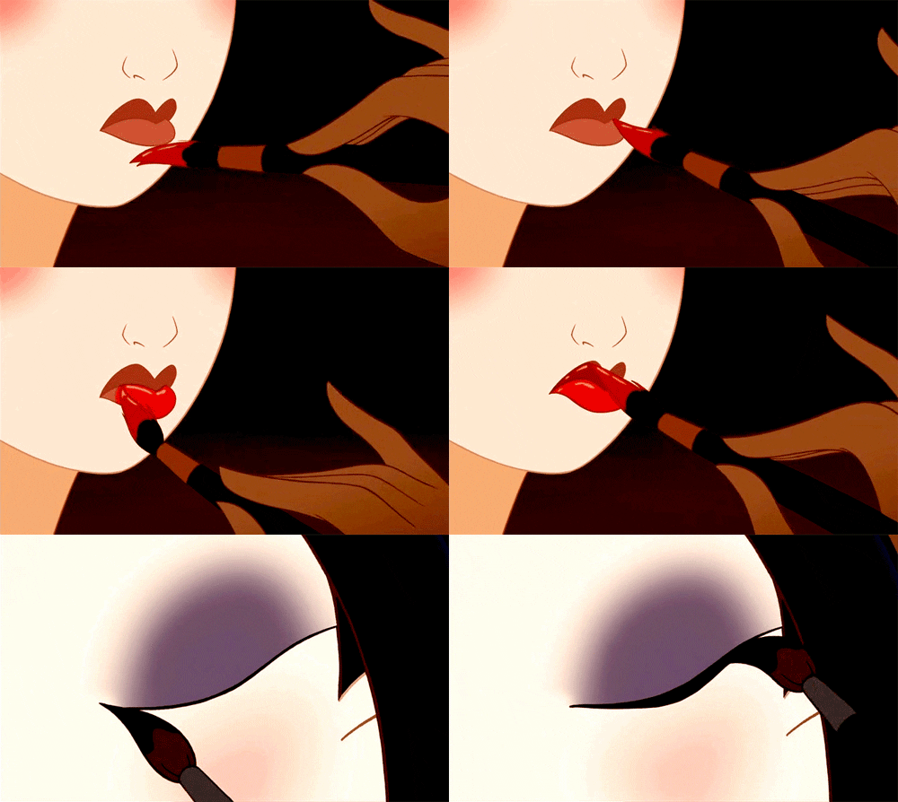
disney makeup lips mulan