Thursday 31 March 2016

Copyright information

90s retro vhs warning vcr
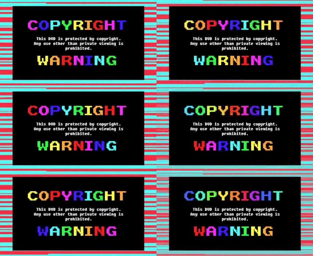
Copyright Information & Forms for CD, DVD and Blu-rayInitially I didn't really know what to expect when creating a copyright tag for the bottoms of my digipak. 
I researched ideas on Google and I took photos of albums in HMV. 

I then started to construct mine, however I struggled in trying to get the Photographic symbol (p) so I searched through dafont.com for ages trying to find any font with the symbol. 
I managed to find a font called 'rally symbols' downloaded it then I was able to construct my own as shown below 


the it crowd copyright copyright warning

Thursday 24 March 2016

Organising my cast screenshots


These are some of the initial messages to my cast in order to get them to give me information about when they could film and when they couldn't. The advantage of having face-time has also allowed me to show my cast how I want their makeup to be and how I want them to act. This has been done through not actually meeting up, but by frequent face-time calls therefore allowing my to get some blog work done when they are not actually filming. 
This method seemed to prepare my cast well as it meant that I was able to tell them what i wanted to do using my facial features and over video as opposed to writing it, which could have been interpreted differently. 
Also, the use of testing has enabled me to make quick contact with those who are in my music video in order to allow for them to call me if they get lost on the way to my house or to be able to message me to say if they were going to make it or not.
I did have a bit of difficulty in organising my cast because I ideally wanted to get all three of them together, however I was only able to do this on one occasion as Mollie had another thing planned. Mollie also was rather sick (it was winter when I filmed) therefore standing outside was very difficult and sometimes we felt it was best for my actresses welfare to not go ahead with the filming for the day. 

Tuesday 22 March 2016

Editing the TV sections

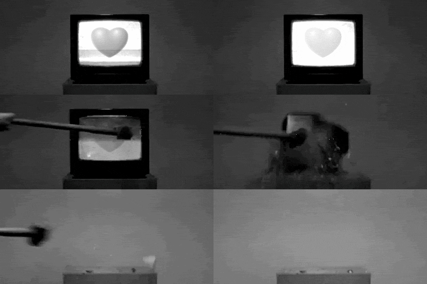
tv art scary broken b&w


Firstly, my editing started with the TV introduction, this involved getting two clips to look as though it was in the tv whilst the TV was moving. (very challenging and time consuming). 
I have recorded the screen from when I did it. 


Towards the middle of the video there is another section where I have used the TV again, this time I have used the overlap tool on Final Cut Pro in order to give the clip some texture. I used a clip of the Queen of Hearts for this section. 


The end of the video is met by the destroying of the TV, this was only sped up and due to my lack of lighting when I was filming I didn't manage to capture the second the TV smashed (gutted, I know). - Blame my sister for that one!! 
I slowed down the clip x 50 in order to capture the glass coming out of the screen. 
In this shot I sped up the hammering of the TV. And increased exposure of white. 

 The very end

This is a still shot of the TV, similar to the one at the start. 


I used a preset I created from the TV scene before and then lowered the black exposure and increased the white exposure in order to create this effect. 
I  then layered the tv clip with a shot of Mollie in the bath, this reminded me of my textual analysis with Primadonna. As I used the 'bad tv' effect on Final Cut Pro. 


tv black heart broke broken heart

Monday 21 March 2016

Use of Fonts on my digipak

 These texts show the idea of typography. I wanted to use different fonts in order to convey a sense of individualism in my digipak. This gives each song a particular characteristic. These have been used in an unconventional way, this is because on the back of most digipaks the track lists are all in one font. However due to the abstract nature of the genre and my music video I felt it appropriate to suggest and develop these conventions in order to give my product a unique selling point to the audience. Here are some of the fonts I have used and for what text.


Sunday 20 March 2016

Draft 1 advert

This is my first draft, it has been said that my advert has too many blank spaces. I will alter this as I feel as though my advert is rather unbalanced. I think that the 'out now' section should be placed central as opposed to on the Left. I also think that it would be much better if the Album name is at eye level as opposed to at the top. This would make it much easier to read and draw more attention to the artists name. This therefore makes it much better for the audience to understand and see what the album is about.
I have had some feedback throughout the stage of my advert design.
'I love the idea but I think it looks unbalanced with the typography at the left side'
'I love it, I think it looks really quirky'
'I think that the layout needs to be altered but you don't need to change the imagery or fonts, just muddle it around a bit' 

Thursday 17 March 2016

Apple Reference


disney movies cartoons & comics pretty magic


I have decided to use my character of Alice to eat a red apple in the video. 


This is purposefully decided in order to convey the Disney behind the meaning. Snow white ate an apple which was poison. 
This refers to the poison in her drugs and how it affects her. This uses a postmodern convention and is using intertextual references to Snow White.


 The principle being that her bad decision to eat it changes everything. This is similar to Alice and Wonderland when there are biscuits to eat and drink things.

the end black and white disney vintage 1931


Wednesday 16 March 2016

Interesting coincidence

interesting spock leonard nimoy eyebrow raise fascinating


Melanie Martinez just released the 'cry baby' music video (it's on the same album as my song) 
In the music video she has also used a rabbit mask like I have done in mine, this may show that my ideas are similar to that of the actual artist and may play a continuity role in the album. 
This would place my video as being very relative to the way she actually wants her videos and although I am not making the video for her album per-say, it would now tie in quite well. 


interesting more inside amy schumer i like it

Imagery Of Existing Digipak

On the 16th March I went to Birmingham for a university visit, I went to the Bullring shopping centre and was greeted with a huge HMV. 

Although I was looked at a bit strange, I took loads of pictures of current albums with my genre and just other covers which I liked 
Examples : 
Rihanna anti
This album cover is an abstract cover, It features an almost psychedelic child holding a balloon with a crown placed over his eyes. There is a fierce essence about this image, the contrast between the red and white symbolizes danger, passion and blood. Therefore suggesting it to be one of Rihanna's most deadly albums. 
The back cover then features the same child as though the Album is 3D  as opposed to being 2D, this could argue to break the fourth wall, by acknowledging that the album usually doesnt show the back of an image, it gives the audience a false sense of reality with this album, this may subliminally suggest that she is a real artist as opposed to the fake ones.
Marina and the diamonds - the family jewels
This image is nice in that, it is very simple, she is clearly photoshopped and is laid down in an unconventional way. This is an image which has been created in order to place the font in a certain way, rather than vice versa. It is just a standard image of the artists taken in a photo studio in order to put the textured vintage background behind her. 

Marina and the diamonds - Electra heart 
This is a close up shot of the artists, this will be used in order to address the audience directly as opposed to an abstract cover. Marina is more known for her self absorbing in her music so it actually worker for her very well. 

Aesthetically similar to my song and video 


Barcode Research


As my album is colourful, I need to check what colours my barcode could be by the regulations.


More non scanable barcodes 


I wanted my barcode to be white initially so I have had to change my idea as I have realised I can't scan it that way, therefore I will attempting to use a different colour or just using the black barcode which is used for most products .

Tuesday 15 March 2016

Music Video Draft 3

chain curtain The video is now completely fully, there are no gaps all the way through.
I will still use feedback and my own personal perfectionist attitude to develop this further. This was completed on the 15/03/16. Overall the time editing was around 9 hours. 

My feedback was highly positive, I got a lot of good comments from people. As shown below.
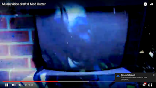
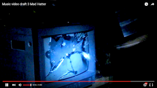
These comments were very much appreciated. Although I recieved extremely positive feedback, I wanted all of my target audience to be very please and gratified by my music video. However, I feel as though I could improve certain shots of the music video. I wanted it to remain continuous throughout and one of my friends and mother pointed out that there are two particular shots that may need improving. (Below) 

Monday 14 March 2016

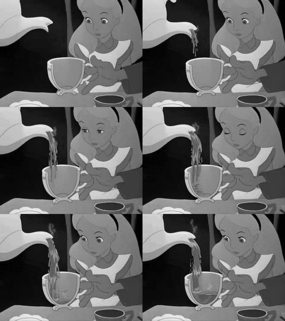
Food colouring for tea shots


black and white mad hatter tea party alice and wonderland

I have used blue food colouring in the shots used for my video. 
I used Luke warm water and mixed it with this food colouring. It gave my water a colour and texture in the process and I thought it might look a bit better than using clear water or tea for that matter. 
These are the results of the colouring. I have taken screenshots from the raw footage that I got from using it. 
I made sure that I had a few practise shots with the tea in order to see the pigmentation. This will work very well with the idea of my music video being conceptual, because it is different. It reinforces the idea of things being different and strange. 
I found that on this practice shot there was not enough pigmentation. Therefore meant that I had to add more colouring in order for the camera to pick up on the blue colouring. I feel like it works well in this shot because of the fact that everything is blue, the costume, the teacup etc. 
film alice in wonderland alice mad hatter tea party