A2 Media Blog
Enea Luciano
Monday, 25 April 2016
Evaluation Q1
In what ways does your media product use, develop or challenge forms and conventions of real media products?
Although very basic, my music video incorporates all of these qualities, so it can be suggests that it is very conventional in comparison to most music videos. In this respect we can see that the conventions of form have been achieved.
In order for me to gather understanding of my particular genre (indie-pop), I had to look at existing products. Therefore I conducted multiple textual analysis' of those in my genre and those out of my genre. This enabled me to decipher which genre my music video would fit into. Therefore, leading to the overall music video being successful as a product with my target audience and for the indie-pop genre.
This is what I did to ensure I understood the conventions of other media texts, therefore giving myself a vast knowledge on what is conventional by a rap, pop and indie music video.
In order to get a more defined knowledge on my particular sub-genre. I looked specifically at 'carousel' by Melanie Martinez and 'Primadonna' by Marina and the Diamonds. I then devised a textual analysis on both videos to compare and contrast the different conventions within them.
For my product, I chose to ignore the typical conventions of an indie-pop music video as I didn’t include any establishing shots and I chose to make my music video conceptual as opposed to performance based and narrative based. I have completed a textual analyses of my own music video – including how the use of mise-en-scene, editing, cinematography and sound is used to make an appealing and enjoyable music video.
Lyrics and imagery
Within my music video I tried to make my work look as professional as possible. Through research, I have found that there is always a connection and a link between the lyrics of the song and the visuals; this is common to keep a solid narrative. Therefore, I devised a lyric analysis to my chosen song, in order to understand it before I came to any planning. This is most important when trying to create a conceptual piece, because the lyrics should always be represented by the visuals in order to create an effective music video, this is mainly because of the fact that there is no narrative to the video.
This is a small mindmap in order ot consider the lyrical meaning.

This is my in depth lyric analysis.
Lyrics within a song create a link between the artist and their experiences which they are portraying to the audience through singing. By doing this process of analysing the lyrical meaning of the song, I was then able to piece together certain visuals to represent this meaning. I helped me devise an overall theme of Mental Illness and drug abuse, not to mention the idea of Alice and Wonderland.
Imagery Used
The imagery used when referring to the lyrics is a very conventional feature of a music video, it allows the audience to visualise what the song is about. And it occurs throughout, conceptual, performance and narrative music videos for every genre. This is why my music video is effective in this aspect as it is incorporating a long renowned convention into it to enable the audience to recognise it is a music video, and also to gratify the audiences' decision to watch the video.
 |
| The use of the imagery here is present. I have used an editing effect by changing the hue of the shot in order to reflect the blue caterpillar reference from Alice and Wonderland. This is effective because it proves to resemble the caterpillar himself as opposed to actually using a live creature. The audience will recognise the mise-en-scene as though she was the caterpillar that the song is referencing to. This works well because it isn't explicitly shown, rather so it is inferred to represent the lyrics. |
 |
| This imagery is using a phrase 'getting drunk' and displaying an image on the screen as if it were alcohol. This play on the theme of Alice and wonderland and the dark meaning is shown through the use of the teacup and the blue liquid. I chose blue liquid in order to add to the colour throughout my music video. However, the blue liquid could be seen to be that of Bombay Sapphire, which it a blue coloured gin. Therefore, drinking it out of a teacup is rather ironic. However the imagery of showing a liquid substance getting poured and the use of the mirror effect onto this shot gives a sense of intoxication, which is what I wanted to get from this. |
 |
| The prop I have used to depict this lyric is a red knife. I used this imagery as a way of showing that the artist is in fact a dream. What I mean by this is that the phrase states 'dream is a killer', with reference to the TV scene, I noted that those shots look as though the camera is engulfed into this alternate reality. Therefore suggesting that it is in fact a dream, so the dream is her. so she is killing herself as a result. I also chose to use this as a play on 'Psycho' the film, because the slasher film used a large knife in order to carry out attacks, I thought the connotations of using a knife would be similar as opposed to a gun for example. The acting also suggests that she is cutting her throat, which suggests that she is suicidal. The choice of the red knife was to make sure that the knife stood out when I was filming and also to represent blood shed. |
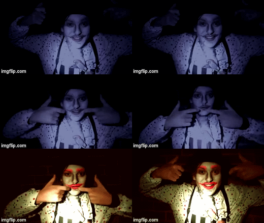 |
| The uppers and downers representation. This is on the line 'the craziest friend'. And by crazy, I mean up and down in personality, whether you want to take that as bi-polar or just that the Mad Hatter takes uppers (stimulants such as cocaine) or downers (opiates such as heroin) is completely up to the audience. I have used it on this line because of the featuring word 'craziest', the mad hatter is renowned for being completely insane. This is shown through the use of the mise-en-scene. I have used this imagery in order to show the Mad Hatter pulling his smile down to then bring it back up again. This is telling the audience that his mood changes very often, therefore suggesting either a cause from drugs or a mental illness. I believe that I achieved this from the colour filters I applied in post-production as well. By using a blue colour effect onto the shot of him pulling his smile down, it suggest he is in a bad place and is upset or cold hearted. The use of the warming filter connotes the ideology of being happy and full of life. |
Lighting
The lighting in my music video doe not conform to my genres stereotypical lighting method. As I have previously found out, the indie pop genre is much more likely to have soft light as opposed to hard light, which I have used. This is because it gives a vintage feel and an almost retro outlook, however my lighting was a very important part of my mise-en-scene decisions. This is because the contrast between the dark and the light is very drastic, connoting ideas of mania as opposed to shades. This is important in the overall appearance of my music video as well, as I wanted the video to be trippy, so therefore hard light is essential. I made a video in order to demonstrate my lighting choice when I had made it, it uses a number of different music videos from different artists, across many different genres in order to show that my music video doesn't specifically conform to an indie-pop genre music video, however it does use a type of lighting which other music video's have done. In saying this, I would say that my music video develops as opposed to rejects the conventions of lighting in a music video mainly due to the fact that other genres such as rap, RnB and pop use this style of lighting.
To show you what I mean by this here is a reference to the lighting video that I constructed:
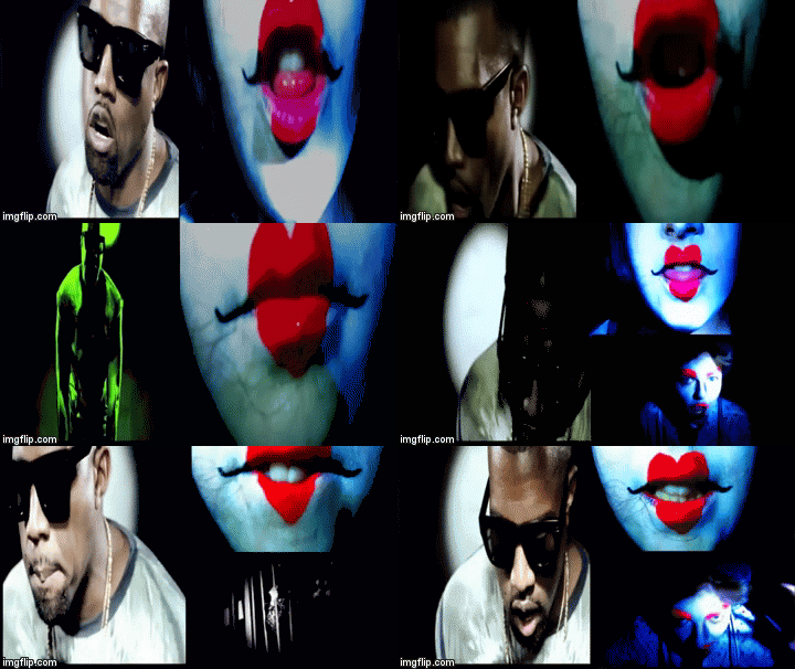
Madonna 'Vogue' uses the same lighting techniques as me, however her video is in black and white. We can see the similarities from the video below. I have used a split screen in order to show the comparison on one image making it easier for you to see the similarities.
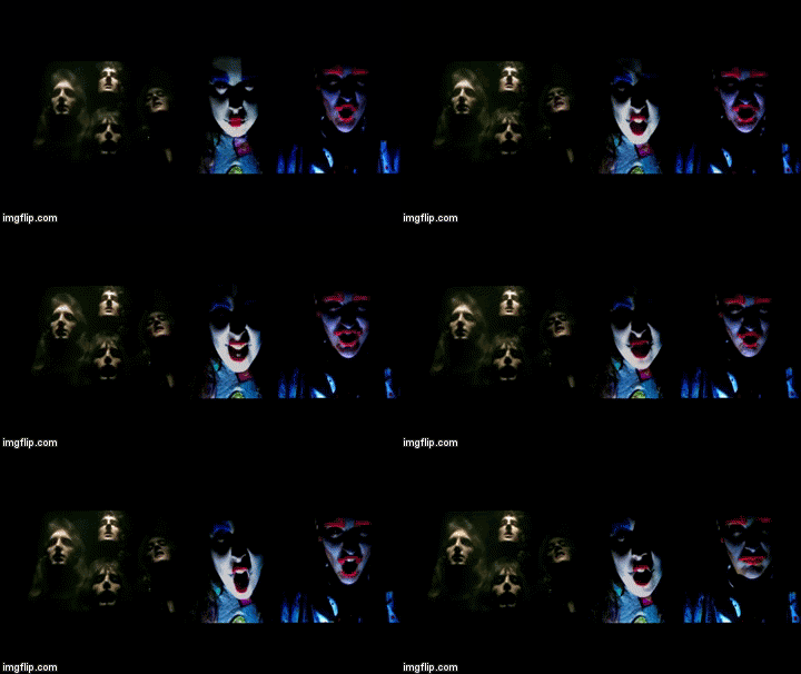
The use of the hard lighting is a similar effect to that of my music video. The hard light makes the background seem very dark whilst hitting the key features of the face. So in that respect, my music video is using an established convention of a music video's mise-en-scene. Therefore making it seem much more professional and authentic.
The other lighting similarity is from the rock genre. This is Queens 'Bohemian Rhapsody'
Costumes and Makeup
Costumes and makeup are a large part of the mise-en-scene. This is reflected all throughout the existing examples I have looked at. Especially in my music video it is extremely important, as I had gone for an Alice and Wonderland theme, I had to ensure that my media text was still conventional whilst applying these makeup and costume ideas to my cast. This was difficult to achieve because I still wanted an element of creativity in my designs. Therefore I put my own twist onto the styling of my artists. Making them noticeably the characters but still having my own personal style to their costumes. Throughout the music video Alice can be seen to wear 3 different outfits, although I planned for more I was unsure whether it would look as effective. My other characters only had one costume, therefore suggesting that a key element to their presence was the costume itself, that can be said for the queen of hearts who was wearing a pastel grunge love heart jumper, and the mad hatter with a pork pie hat.
Genre Theory Relating to my video
Locations
Throughout my music video there are a number of locations, therefore making the video seem authentic and real. This is because most music videos acquire more than one location. Although there is one dominant location, (against the wall). My music video includes scenes from a bath, a playground and against a brick wall. Therefore, suggesting that it does conform to the standard music video in terms of locations used.
Location 1
Location 2
My garden, particularly up against the brick wall, which has a deep red colour to it in the light. This will give me a good postmodern element which will confuse time and space, this is because the clothing I have bought for the characters is very vintage, therefore mixing the urban street brick wall effect with the vintage clothing will almost give a juxtaposition and make it seem as if it is Alice and Wonderland 2.0 in the current day as opposed to back in time when it was supposed to be set.
|
Location 3
| Playground, although I am not entirely sure which playground I will be using (as I have 3 local playgrounds) I will go to look at the weather on the day of filming and also the variety of equipment in those areas. I want to have a swing, slide and see-saw, this will add to the idea of the childlike references, however when people go on the see-saw at night it is seen as creepy, this is exactly the look I want to go for.So therefore I must make sure whichever playground I choose will have these activities available. |
 Throughout my video there are four actors, Myself, Liam, Nazarena and Mollie. In most music videos there is usually one main actor. However in my video there are 5 different characters throughout. This was a conscious decision that I made in order to screw with the audiences mind. I wanted to make sure that the audience didn't now who the main singer was and I feel that throughout the use of lip-syncing with every character that this was achieved. In most circumstances where there is few actors, this usually suggests that it is a band. Therefore my music video develops the ideas of how many actors and how large their roles should be in order to confuse the audience.


Colour
The colour used throughout my music video is rather unconventional to my genre. Im an not 100% as to what this colour scheme would fit into however the use of colour suggests a bold statement. These are some of the colour schemes I have used for my products.
As I have previously stated, I wanted my music video to appear to be different due to the lighting and colour scheme. Indie pop music videos are usually pastel coloured or a grey coloured as opposed to bright and bold colours.
| This is Melanie Martinez's 'Pity Party' music video, as you can see this is an example of a pastel colour scheme, this is a very common convention of indie pop music videos. It gives a sense of pastel grunge and is appealing to the audience. |
Cinematography
In terms of cinematography, my music video is rather conventional. It contains a lot of different shots. This is shown below.
This therefore suggests that my music video doesn't challenge these shot types that are typical of music videos, instead it conforms to this rule directly. Although my music video doesn't contain any establishing shots, it is not required by my theme of music video with it being a conceptual music video it is not required. Conceptual music videos tend to use much more close up's and extreme close up's because it tends to focus on the detail as opposed to the bigger picture. Because this is such a key quality for music videos to contain various shots types, especially in a conceptual music video the key aim is to keep the target audience focused throughout as opposed to not watching the video properly. Although I used a lot of close-up shots and zooming, I felt as though this were appropriate to my song choice, however music videos in indie-pop tend to use much more medium close-ups as opposed to close-ups which are much more conventional of RnB videos. Mirror phase - Jaques Lacan. The use of close-ups is reflecting the audience themselves. It shows them who they want to be, which works with Dyers Star Theory.
 My editing is very fast, it is very much in time to the beat. This reflects the fast paced nature of the song. I asked my target audience if they would prefer this method of editing, it was a resounding yes. Other than narrative music videos most videos use this editing style. It adds to the appeal of a song. It works in order to establish feeling and emotion within the audience. For my music video, it was very easy to do this because of the prominent back beat which occurs throughout the whole song, therefore making it much more easy to work with. Throughout, I would use a variety of small clips in-between the bests and then on the beat put something prominent. Indie pop music videos are much harder to pin point, because it is by definition different to the rest, it is very hard to say which style of editing is frequently. I would suggest that from my research that it is usually fast paced and in time to the music. Therefore making my music video conform to the norms of this editing style. I would suggest that it is much more like a rap music video, as this is always done in rap music videos. For example, Kanye West with 'All of the lights' or 'n***as in Paris', these both use a similar effect to mine in that they both use flashing lights and strobe light effects when transitioning.
 Props
In terms of props, different videos use a various amount of props, some use none and others will use a lot. For my particular genre, I find that it is more conventional to have a lot of props. For example, from my textual analysis of Carousel and Primadonna, we gathered that a lot of props were used. Therefore, In attempt to remain conventional in this aspect I used the various food as props. I also used other stuff as shown below.
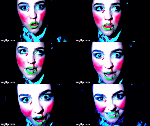
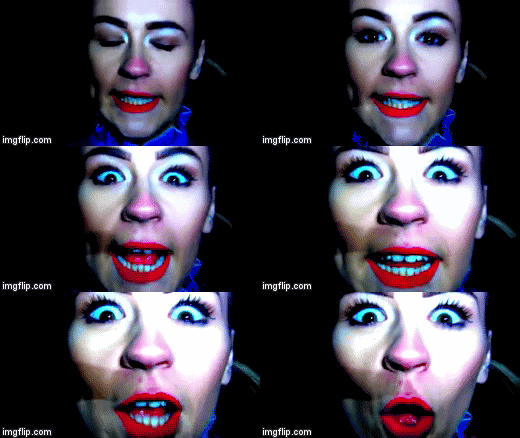
In order for my video to look like a real music video for the genre I was going for (indie pop) I understood that I needed to ensure that my music video included the use of the conventions for lip-syncing. When looking at all existing products from my genre they all tend to have an element of lip-syncing. My music video contains a lot of lip-syncing, which although is a performance based convention,many music videos have it. Dyer argues that a star's meta-narrative impacts on what audiences consume in terms of products, with his name argument being that stars are manufactured and that their images are constructed and artificial to appeal to a specific audience.

You can see from this the various examples.
Ancillary Text
This is showing the basic conventions of a digipak with relation to my design. I have been accurate in my approach to following the conventions. Similarly to last year where I had to make a music magazine, I relied heavily upon the conventions of this in order to make sure my product would be seen as a real life product as opposed to an A level piece of work.
Front Cover analysis
When looking at the conventions and codes in detail I have applied my knowledge of the real life products onto my own work. This therefore confirms that my digipak is very much a genuine and authentic looking product.
Some examples of my textual analysis:
 |
| I have taken the idea of the parental advisory sticker from this, although my song is not explicit, the rest of my track list is, therefore I found it very important to use this convention. |
Back Cover analysis
 |
| Throughout my back cover analysis of my own product I used a lot of references to previous examples below. |
 |
| Coldplay are an indie rock group, therefore I could say that the use of the colours were very good for my digipak, although I feel as though I made an improvement on this because of the fact that the face is the only thing that its coloured. |
In order for my digipak and advert to be conventional I thought it to be necessary to include a motif or logo for my artist, therefore suggesting a brand image, which is massively important in the music industry.

TRACK LIST
I also found it very appropriate to construct a viable track list, as opposed to making up the names of songs I researched possible existing songs in order for my product to be put onto a CD. This therefore makes it much more than just a name of songs it is actually audible and they all go together very well.
COPYRIGHT INFORMATION
I felt it necessary to include an accurate copyright information statement for my back cover, this is highly conventional.
Advert
This shows the key conventions of an advert for my debut album. These images show that the conventional features are almost replicated by my music video.
This shows that my advert is highly conventional and could be seen in everyday world and be recognised as something that is real.
Real life products
I have shown this in order to reflect how my media product would work in the real world. Due to the nature of the business, synergy and brand awareness is vastly important in the music industry therefore, devising ideas as to where my products would feature is important is sussing out the pragmatic side to my products and also understanding how my audience will end up being able to view and see these products.
This video is showing what my song would be like when announced on the radio, although my research suggested that Radio X, Absolute Radio etc were more suitable I was not able to get a hold of their 'jingles' therefore Virgin Radio was fine. Virgin radio also have music similar to what my genre is so therefore it works quite well. I have attempted to show what it would be like for a radio presenter to announce the song with the artists name. I think that this is effective in showing the real everyday use of the song in a commercial way.
This is a segment from the 'Alternative charts', this would feature on YouTube or on MTV Alternative channel for example. I have used this in order to show what a clip from my video would look like in order to display my song in the charts. This would definitely be used in everyday life for my target audience and for alternative artists, so I think it was important that I used this method of showing my work.
This video shows the real life product I have made, this is exhibiting the practicality of my digipak, I have also made it as if it were able to be sold at HMV. This is demonstrating the idea of my products being feasible to work and also how effective it would look in person.
Subscribe to:
Comments (Atom)


