How effective is the combination of your main products and ancillary texts?

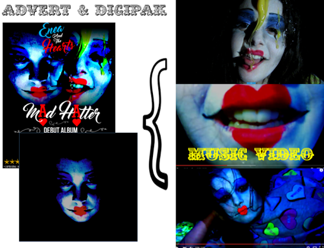
My products effectively use synergy in the use of fonts, logos, costumes and colours in order to create an effective collection of products.
My ancillary texts also link to my video because it is clearly the same artist on the front cover as it is in the video, as well as the elements of mise-en-scene being repeated; The location of the narrative in the video is the same as the one on the ancillary texts (outside in the dark). The lighting is exactly the same thanks to the use of the torch and hard lighting. The costumes are also the same in the music video as it is on the ancillary texts.

Logo/motif
My ancillary texts also link to my video because it is clearly the same artist on the front cover as it is in the video, as well as the elements of mise-en-scene being repeated; The location of the narrative in the video is the same as the one on the ancillary texts (outside in the dark). The lighting is exactly the same thanks to the use of the torch and hard lighting. The costumes are also the same in the music video as it is on the ancillary texts.

Logo/motif
Costumes
In order for my products to remain constant and stable throughout my project, it is very important to ensure that the image of the artists and characters remain constant throughout. This will ensure that the audience are able to grasp the concept and understand the overall theme of the Album. As the album features all Alice and Wonderland songs and themes, it is important to push this theme forward to be able to get the audience to grasp my concept behind the artwork and advert.
The costumes I have used throughout my video are very similar, they all suggest a vintage and quirky style, being typical of the indie genre. They are also very eye capturing, for example the Mad Hatters dungarees- which are black and white pin stripes. This therefore connotes the idea of the music video just through the use of my costume design. I have featured Alice in the signature blue dress on the digipak and aside from that I have ensured that most of the images are head shots. This is included onto my advert, which doesn't feature a costume.
My music video and my digipak are linked in that the white rabbit mask is on the front cover, as the white rabbit makes a few appearances I felt as though I should include the symbolic character somewhere. Also with using Alice sat on the bench with her blue dress it intertwines with my music video because of the fact that the audience can clearly see the dress in the music video. On the left is the screenshot from my music video and on the right is my front cover for my digipak.
The makeup for my characters remains very constant throughout all of my products, I tried very hard to ensure that the makeup in the music video was identical to the filming nights beforehand therefore giving a strong sense of professionalism as well as continuity.
On my digipak, because the images are mostly close ups, the audience will be able to identify that the makeup is the same from the video. This is what I initially had in mind as it again draws in continuity and creates an effective piece of work. It acts as a brand image, similar to a logo. This is because it is what the audience will remember, especially seen as though my costumes and makeup are very bold and out there, it will stick into the audiences mind and therefore whenever they see the image of the advert again, they will sub-consciously link it to the music video.
Colour scheme
My music video colour scheme (using coolors.com to create my own pallette):
My Magazine Advert
DigiPak Front Cover

DigiPak back cover
As you can see from the colour schemes I have made, all of my products have a rather similar colours scheme, all including blue and red and black. This therefore tells my audience that the colour schemes are relatively similar and therefore create a sense of continuity between all of my products. This is a good thing because it would be able to be recognized as 'Enea and the Hearts' product. This therefore means that the products I have designed and created are very effective to the audience as it leaves a certain design and colour scheme in mind to the viewers. I think it is very important for the colour scheme to be continuous, this enabled the audience to identify with the products and promotes the product very subtly. Even if the audience do not see the music video because they have downloaded it on iTunes for example, there is still a strong sense of collectivist from my ancillary texts.
FontsMy audiences' opinion
My research has shown me that my products are effective individually and as a whole. Overall, the effectiveness was very good. People said that they would see more from the artist and download my music from this one music video. They also said that my advert drew attention for them. Which is the main purpose of the advert. It was also to inform my audience about the release date, however none of them seemed to mention this apart from one person. Therefore this may suggest that my image was much more bold than the release date.
They seemed to suggest that it followed all of the conventions clearly and therefore made the products seem real. They were able to identify the fact that it was indie/alternative. I'm not picky about the sub-genres because unless you listen to that music you wouldn't know. Overall my target audience seemed to be impressed and happy with the combination of my products. They all agreed that for the reasons demonstrated above that there was a clear house style which gives my products a strong sense of continuity.
I also conducted an interview style focus group with Sophie. This proved to be very useful and quite flattering. She feels as though all of my products are noticeably very similar and gives a good house style because of this. Therefore suggesting that this was because of the fonts and the imagery, as these factors are a large part of my ancillary texts and music video I would suggest that that would be correct in my opinion too. Sophie is in my target audience therefore I can be confident when saying that my target audience would be happy with my products and would be willing to buy them.
She also goes on to say that my products are effective and fulfill their purposes, which I think is extremely positive feedback. I am happy with my final products now I have the verification from my target audience that they are effective in their purpose and are also very gratifying to watch and look at.
Although it is evident that my products are effective in terms of combination. If I were to do this task differently, I would address the idea of making a clear brand range of products, including merchandise and a tour date poster. This would make a the brand image much more prominent and add a sense of realism and continuity. I would also make an actual logo from symbols as opposed to a certain type of font because I feel as though my products would benefit from an actual logo, this would make the impact much more greater and have a bigger impact on the future of my brand that I have created.


No comments:
Post a Comment